Embracing Adaptive Icons: Enhancing Android App Development With ChicMic’s Clap To Find
While an average user never bothered about the app icons, developers and designers understood why adaptive icons can uplift the user experience. The introduction of adaptive icons is one such advancement that has transformed the way Android apps are designed. Join ChicMic as we discover what adaptive icons are, how they are applied, and why they are essential for modern Android app development. We also look into how ChicMic’ Clap To Find is the perfect example of adaptive icon application, adding an aesthetic value to the otherwise mundane UI.
Evolution of Android Icon Design
Android icon design has undergone a significant evolution since the inception of the platform. In the early days of Android, app icons were static, pixelated images that lacked consistency and visual appeal. However, as the platform matured and user expectations evolved, so too did the design principles governing Android app icons.
1. Early Days of Static Icons
The early versions of app icons were primarily static, bitmap images displayed on the device’s home screen. These icons were often simple in design, lacking the depth, detail, and visual richness associated with modern app icons. As a result, they failed to capture users’ attention and convey the essence of the underlying apps effectively.
2. Introduction of Material Design
With the introduction of Material Design by Google in 2014, Android icon design underwent a significant transformation. Material Design brought a fresh approach to iconography, emphasizing principles such as depth, shadow, and motion to create visually engaging and intuitive user interfaces. Material icons featured bold colors, simplified shapes, and subtle animations, enhancing their aesthetic appeal and usability.
3. Shift Towards Adaptive Icons
As Android devices became more diverse in terms of screen sizes, resolutions, and aspect ratios, the need for adaptive icons became apparent. Adaptive icons were introduced with Android Oreo (8.0) to address the challenges of icon consistency and scalability across different devices. Unlike static icons, adaptive icons consist of two layers: a background layer and a foreground layer. This modular approach allows adaptive icons to adapt dynamically to various device configurations, ensuring a consistent user experience across the Android ecosystem.
4. Impact of Adaptive Icons on Design
The adoption of adaptive icons marked a significant milestone in Android icon design, offering developers greater flexibility and creativity in crafting visually compelling app icons. Developers can now experiment with various shapes, sizes, and visual effects to create adaptive icons that reflect their app’s brand identity and resonate with users. Moreover, adaptive icons contribute to a more cohesive and harmonious visual language across the Android platform, fostering a sense of familiarity and unity among users.
What are Adaptive Icons?
Adaptive icons are a feature introduced in Android Oreo (API level 26) that allows developers to create app icons capable of dynamically adapting to different device configurations. Unlike traditional static icons, adaptive icons consist of multiple layers and can adjust their shape, size, and appearance based on the device’s theme, launcher settings, and user preferences.
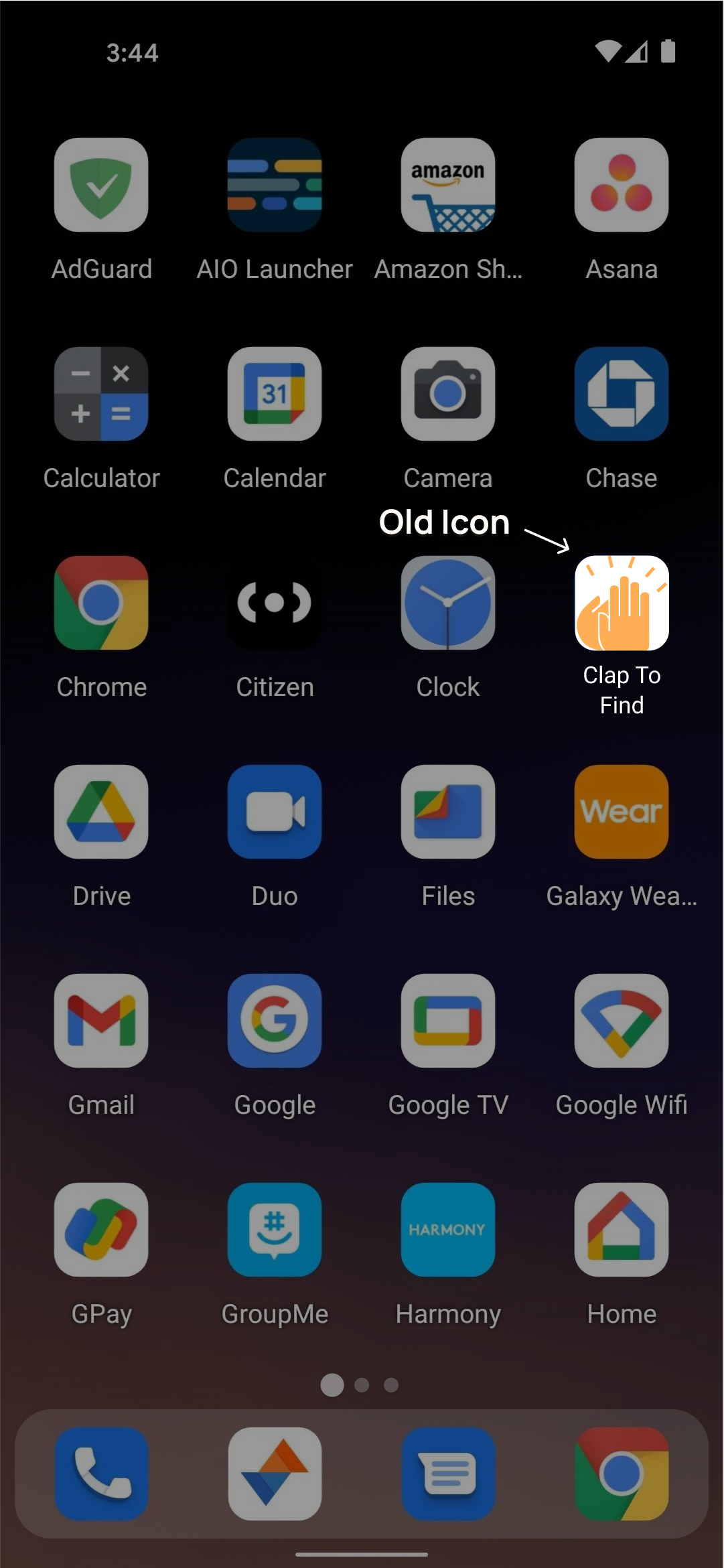
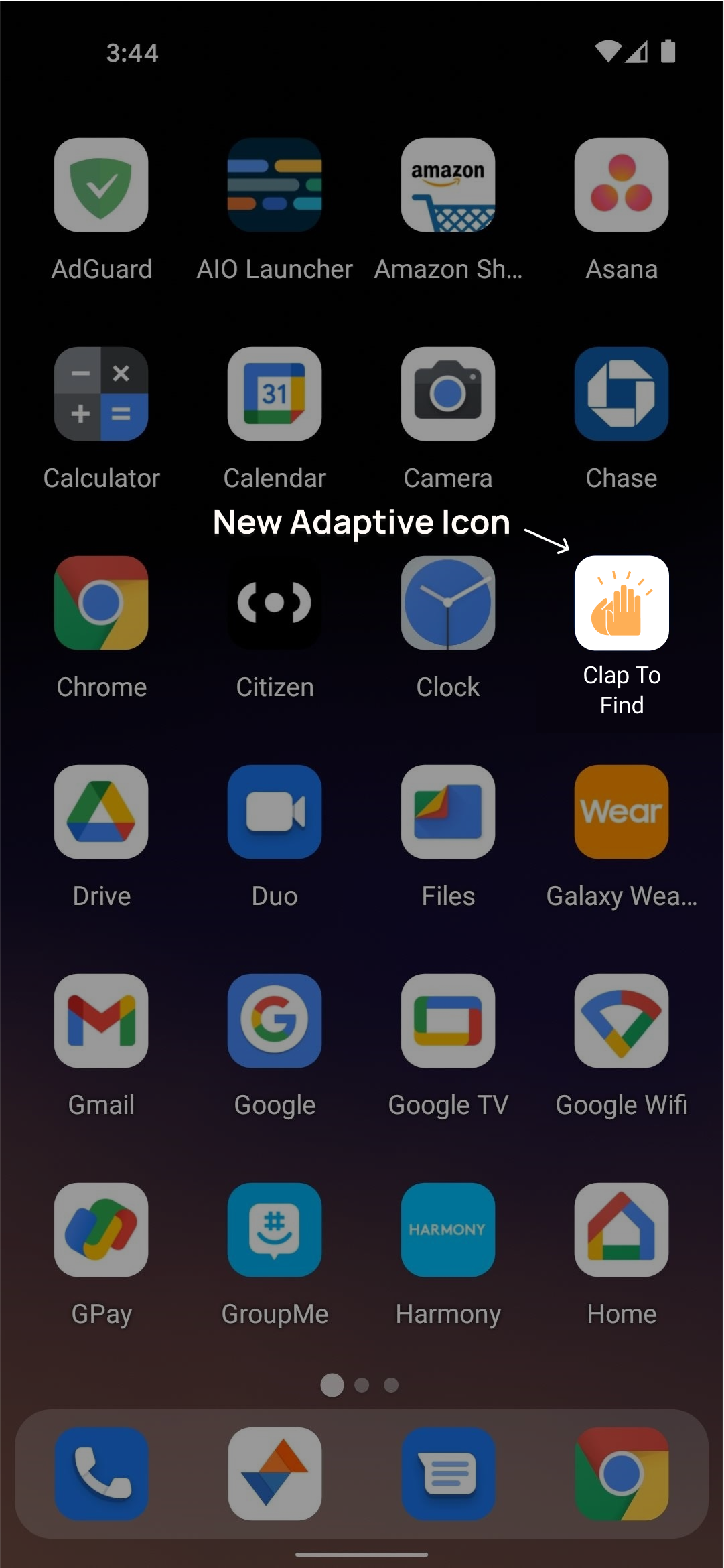
Taking the example of ChicMic’s Clap to Find app, we can understand the significant difference adaptive icons make in the user experience.
A straight comparison between the old and new icons of Clap to Find shows the visual appeal adaptive icons can create.


Applications of Adaptive Icons
The applications of adaptive icons extend to various aspects of app development and user interaction. They play a crucial role in enhancing brand recognition, especially in crowded app marketplaces, where distinct visual identities can make a significant difference. Moreover, adaptive icons contribute to improved accessibility by ensuring that app icons remain discernible and accessible to users with diverse needs and preferences.
- Visual Consistency: Adaptive icons ensure a consistent visual appearance across various Android devices and launcher interfaces. By supporting different icon shapes and sizes, adaptive icons help maintain brand identity and improve user recognition of the app.
- User Experience Enhancement: Adaptive icons contribute to a personalized and immersive user experience by adapting to the user’s preferences and device settings. This customization enhances user engagement and satisfaction with the app, leading to higher retention rates.
- Future-Proof Design: With the continuous evolution of Android devices and screen sizes, adaptive icons offer a future-proof solution for app developers. By supporting dynamic scaling and adaptation, adaptive icons ensure that apps remain visually appealing and functional on emerging Android platforms.
- Streamlined Development Process: Adopting adaptive icons simplifies the app development process by eliminating the need to create multiple icon variants for different device configurations. Developers can create a single adaptive icon asset that automatically adapts to various contexts, reducing complexity and resource overhead.
Why Use Adaptive Icons During Android App Development?
Utilizing adaptive icons during Android app development aligns with contemporary design trends and best practices. They provide developers with the flexibility to create visually appealing icons that resonate with users and reflect the brand’s identity effectively. Additionally, the compatibility of adaptive icons with various Android devices and launcher interfaces ensures that apps maintain their visual integrity across different platforms.
- Visual Appeal: Adaptive icons enhance the visual appeal of Android apps by offering dynamic shapes, sizes, and visual effects. This versatility allows developers to create eye-catching icons that stand out in the crowded app marketplace.
- Compatibility: Adaptive icons are compatible with a wide range of Android devices and launcher interfaces, ensuring consistent and seamless app experiences across diverse platforms.
- User Engagement: The personalized and immersive user experience offered by adaptive icons enhances user engagement and encourages interaction with the app. By adapting to user preferences and device settings, adaptive icons contribute to a more enjoyable app experience.
- Future-Readiness: As the Android ecosystem continues to evolve, adaptive icons remain a forward-thinking design approach that ensures app compatibility and usability on upcoming Android platforms.
Concluding Note
Adaptive icons represent a significant advancement in Android app design, offering developers the flexibility to create visually appealing and user-centric app icons. As ChicMic’s Clap to Find app shows, developers can use adaptive icons to enhance visual consistency, improve user experience, and future-proof their apps for the evolving Android landscape. As a fundamental component of modern Android app development, adaptive icons play a crucial role in delivering engaging and immersive app experiences to users worldwide.